|
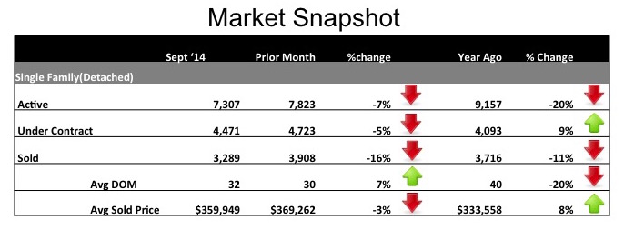
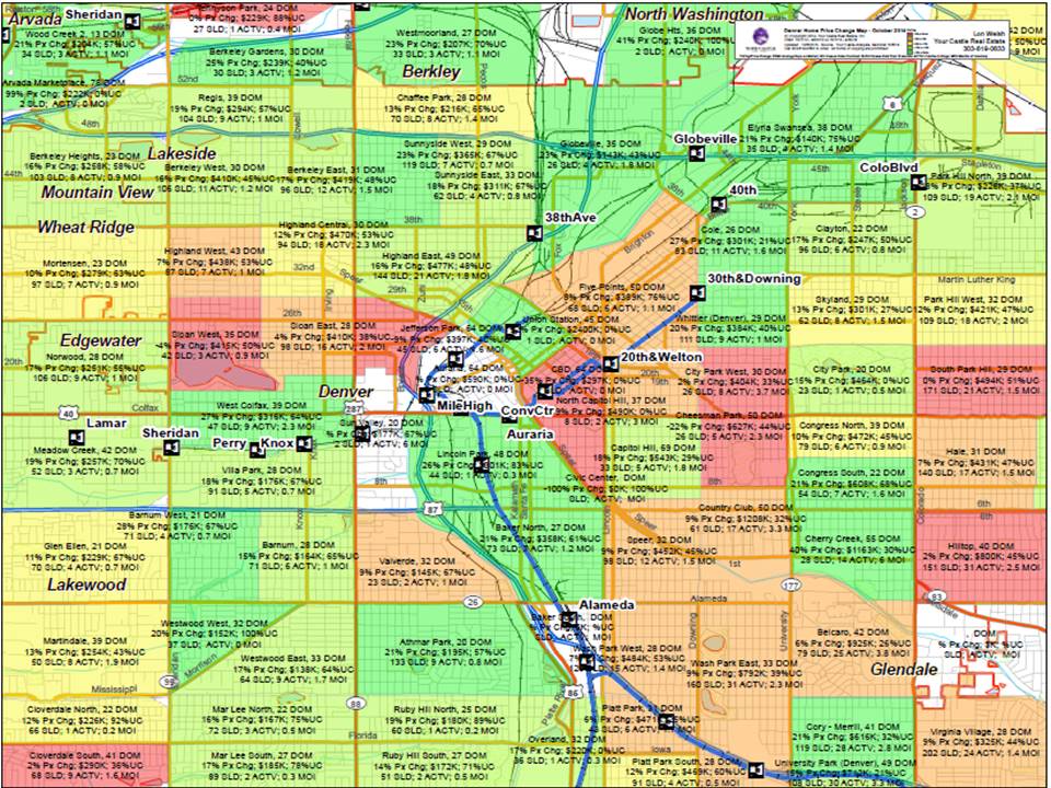
Reporting the market trends for the greater Denver area is a service I love to provide on a monthly basis. The data is interesting, but the story at a macro level continues to be one of a seller's market. Again, this month you can see above that inventory is down a full 20% from this same time last year, the days on market are down 20% and average sold price might end the year showing a double-digit increase. These market conditions lead to questions such as: "How can we help buyers and investors find opportunities in this market?", and "When is the right time for a seller to take advantage of their rising property values?" One tool that is unique to our company that helps us provide guidance is the price change map that we produce quarterly. This map allows us to give you a clear sense of the current real estate trends in each neighborhood. This more micro level hyper-local data advises you on how to make a better decision whether you're buying, selling or investing. The map below is at too low a resolution to review online as it covers a large geography, however once you have a 36" X 18" hard copy of the map in-hand the information is indeed very interesting! If we were to sit down to review the map together, here are some examples of what could be gleaned. First, pick a neighborhood that interests you, say City Park. During the past 12 months in City Park the average Days on Market (DOM) for a listed property was 20. There has been a 15% price increase in the past year, and the average sold price was $464,000. There were 23 sales in this time period, and currently there is only 1 Active property for sale, which equates to a .5 month supply. What does this tell us about City Park? It tells us that prices have been rising swiftly in the past year (low DOM and increasing prices) and the inventory is at rock bottom (only 1 Active property on the market!), which will help sellers in the neighborhood. With currently only a .5 month supply of homes for sale (6 months of supply is a balancedmarket) this is a red hot neighborhood. This example parallels the more macro level trends and a seller could expect top dollar at this time.
However, if we were to take a look at University, the DOM is 29 and there has been a 7% rise in home prices in the past year. The average sale price is $398,000 and in the previous 12 months there have been 149 sales. Currently there are 18 Active properties and there are 1.4 months of inventory. What this tells us is that University is a strong neighborhood with rising prices and low inventory, but not quite as strong as City Park and a buyer might find an opportunity. Although the primary printed map we produce focus on Denver Metro, we can produce custom maps for the suburbs as well. Regardless as to where you wish to buy, sell or invest this tool provides a visual heat map as to where the market is hot, and where it might be a bit more temperate. Give me a call and I'd be happy to sit down with you and review a full size copy of the Denver Metro area map or a custom map for your area of interest. Leave a Reply. |
|
Your Denver Area Real Estate Expert
Proudly powered by Weebly


